Landing Page
Landing Page
Leevr
Leevr
Role: UX/UI Design
Goal: create a landing page for a new SaaS product called Leevr.
Specifications: follow the brand guidelines of the agency that created it (ARISE GTM) but make it feel like a distinct entity.
Role: UX/UI Design
Goal: create a landing page for a new SaaS product called Leevr.
Specifications: follow the brand guidelines of the agency that created it (ARISE GTM) but make it feel like a distinct entity.
I was tasked with creating a dedicated home for Leevr, a new SaaS product, and to clearly communicate its benefits and how users can get started. As an extension of ARISE GTM's work, the branding aligns with ARISE GTM’s guidelines, but we wanted Leevr to stand out as its own entity. To achieve this, we reversed the brand colours — while ARISE GTM has a darker palette, Leevr features a lighter one, maintaining the signature orange as a consistent element.
I was tasked with creating a dedicated home for Leevr, a new SaaS product, and to clearly communicate its benefits and how users can get started. As an extension of ARISE GTM's work, the branding aligns with ARISE GTM’s guidelines, but we wanted Leevr to stand out as its own entity. To achieve this, we reversed the brand colours — while ARISE GTM has a darker palette, Leevr features a lighter one, maintaining the signature orange as a consistent element.


my design process
my design process
Breaking the page up
I started by dividing the page into distinct sections to make the design more digestible. These sections included the hero, about, features, benefits, and call-to-action (CTA), ensuring each part had a clear purpose and flow.
Breaking the page up
I started by dividing the page into distinct sections to make the design more digestible. These sections included the hero, about, features, benefits, and call-to-action (CTA), ensuring each part had a clear purpose and flow.
Breaking the page up
I started by dividing the page into distinct sections to make the design more digestible. These sections included the hero, about, features, benefits, and call-to-action (CTA), ensuring each part had a clear purpose and flow.
Drawing inspiration
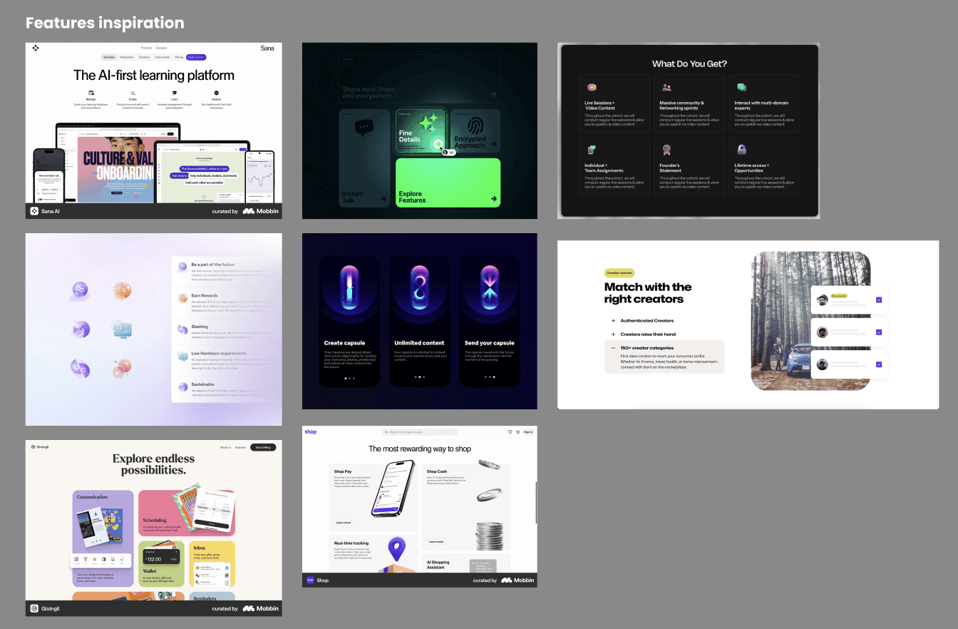
With the sections defined, I created a mood board to gather inspiration from resources like mobbin.com, flames.design, and dark.design. My goal was to find 6-10 layout inspirations. Below is the mood board I created specifically for the features section.
Drawing inspiration
With the sections defined, I created a mood board to gather inspiration from resources like mobbin.com, flames.design, and dark.design. My goal was to find 6-10 layout inspirations. Below is the mood board I created specifically for the features section.
Drawing inspiration
With the sections defined, I created a mood board to gather inspiration from resources like mobbin.com, flames.design, and dark.design. My goal was to find 6-10 layout inspirations. Below is the mood board I created specifically for the features section.


Lofi mockup
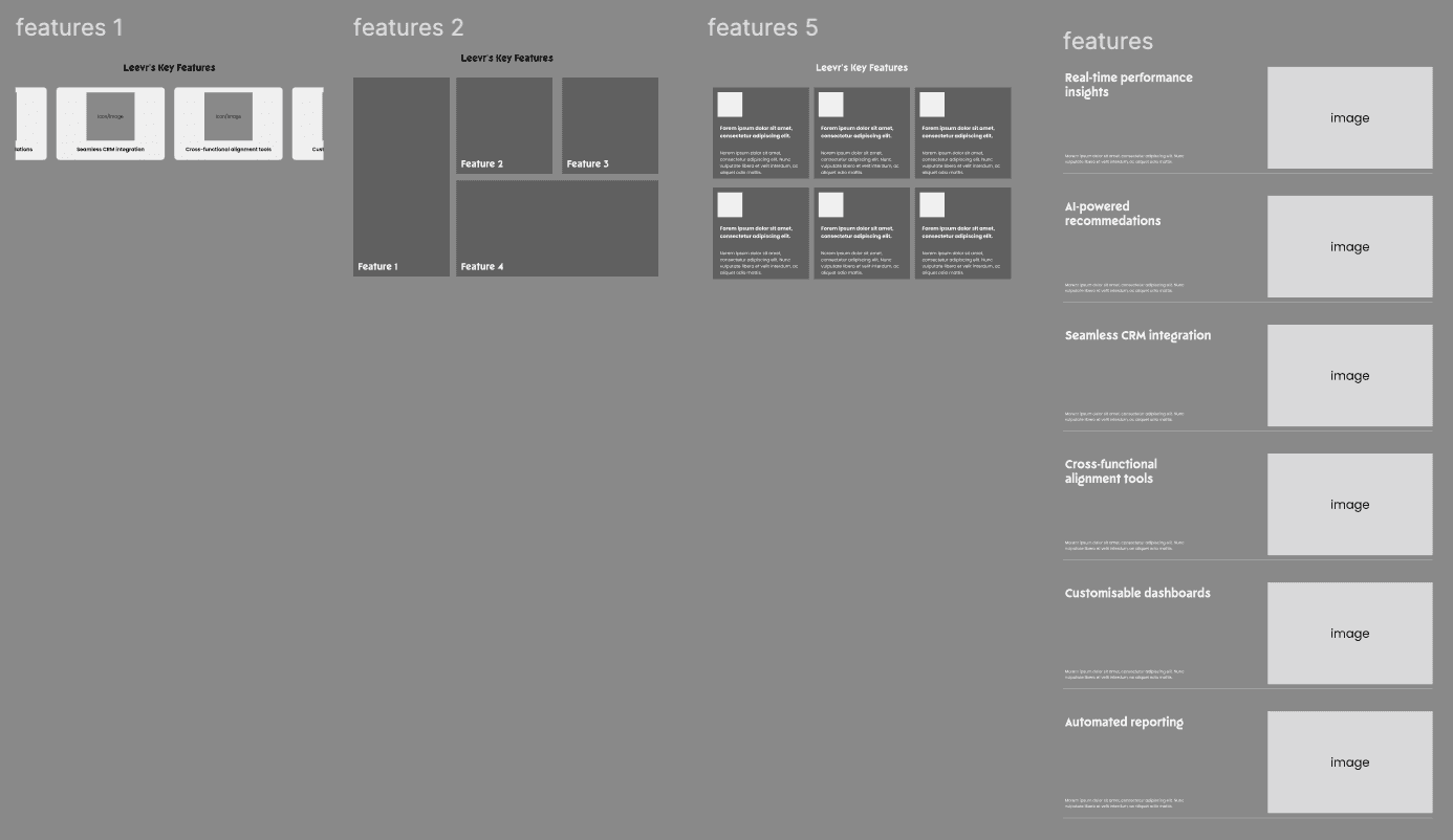
After gathering inspiration, I created 3-5 low-fidelity mockups to give myself and the team multiple design options. I knew that presenting only one mockup could limit flexibility with the page's flow, so offering a range of choices was essential
Lofi mockup
After gathering inspiration, I created 3-5 low-fidelity mockups to give myself and the team multiple design options. I knew that presenting only one mockup could limit flexibility with the page's flow, so offering a range of choices was essential
Lofi mockup
After gathering inspiration, I created 3-5 low-fidelity mockups to give myself and the team multiple design options. I knew that presenting only one mockup could limit flexibility with the page's flow, so offering a range of choices was essential


Putting the page together
After creating a few options for each section, I moved on to assembling a full landing page mockup. At this stage, I experimented with the layout to ensure a smooth flow without any sections feeling out of place. After completing the first draft, I shared it with the team, and we collaborated to make final adjustments.


Incorporating the branding
After making tweaks, I transitioned from low-fidelity to high-fidelity designs, refining details and sourcing images for each section. I followed the ARISE GTM brand guidelines for colours, icons, and imagery but aimed for a lighter look and feel to differentiate Leevr.
Leevr’s design is simple and minimalist, with pops of colour to emphasise key elements like CTAs and important information. As we moved from lofi to hifi, we identified sections that didn’t flow well together. One significant change was the features section, which initially used boxed elements. This felt clunky and disrupted the page's flow, so I opted for a simpler, more fluid design.


dar.
dar.
dar.