
Redesigning Bigteam’s sign up and onboarding flow to collect essential data while keeping the experience streamlined and user-friendly.
The goal is to reduce friction during signup by shortening the initial flow and lowering cognitive load. I also designed flow for a guided tour of the app, helping users get familiar with key features while gradually walking them through important setup tasks – like entering business details and connecting integrations.
This is the first step of many to increase quality of the over all app.
Role Product Designer
Context
We noticed a high churn rate, and after digging into user feedback, it became clear that the app wasn’t meeting user expectations based on what was promised on the website.
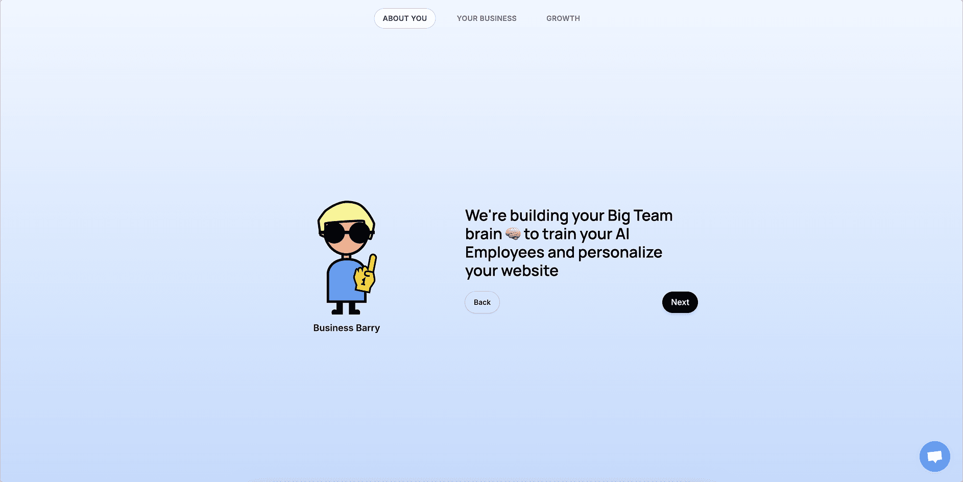
Further research revealed that many users simply didn’t understand how to use the app. Key features were hard to find, and core functionality wasn’t intuitive. To address this, I redesigned the onboarding experience to include a guided app tour.
The tour walks users through essential setup tasks while helping them get familiar with key features, naming conventions, and how to interact with the platform’s agents – encouraging engagement and reducing the urge to skip the onboarding entirely.
Further redesigns on the overall app to come.

Rough Wireframe Concept
Problems
Sign up / Create An Account

User Journey

Moving Payment to the Start
As part of mapping the user journey, one major drop-off point was identified: users were abandoning the process when they hit the payment screen at the end of the sign-up flow. Research suggested that many of these users were simply curious – exploring the app without a clear intention to commit.
To reduce friction and filter out non-serious users, we decided to move the payment step to the beginning of the flow. This will allow us to set expectations upfront and ensure that only users with genuine interest continued through the onboarding process. To support this, we will also make pricing more transparent on the website – clearly stating the flat monthly fee and highlighting that there are no hidden costs.
The trade-off is that we’d no longer capture contact information from users who dropped off at the paywall. However, this is considered a minor downside compared to the benefit of focusing on engaged, high-intent users.
User Flow
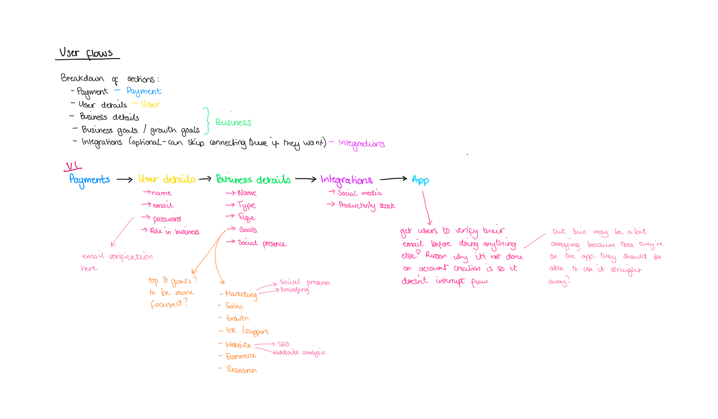
User Flow v1

User Flow v2
I mapped out two versions of the user flow for sign up and onboarding.
User Flow V1 – Too Much, Too Soon
This revised flow follows a similar structure to the original, but with payment moved to the beginning. However, I identified several points of friction that make the experience feel disjointed. Requiring users to input personal details, business information, and connect integrations in a linear sequence is still too lengthy – adding the app tour on top of that only extends the process.
After completing so many steps upfront, users are more likely to skip the tutorial in an effort to finally access the app, which means they miss out on key education. As a result, the core issue of users not understanding how to navigate or use the interface remains unresolved.
User Flow V2 – Introducing a Guided Tour for Better Onboarding
In Version 2, the onboarding flow is significantly simplified. Users complete just two key steps before accessing the app:
Payment – where they begin their subscription
Account creation – where they enter personal details, create login credentials and verify their email
After these steps, users land on the homepage and are guided through a structured tour of the interface. The tour highlights unfamiliar but essential features, helping users understand the layout and functionality while building confidence from the start. It also prompts users to complete important setup actions like entering business details in the “Brain” tab and connecting integrations through the “Integrations” tab, ensuring the app is tailored to their needs early on.
While the tour is strongly recommended, a few sections remain optional, offering flexibility for users who prefer to explore independently. This balance of guidance and autonomy supports both first-time users and more experienced ones, reducing confusion and encouraging early engagement.
Guided Tour
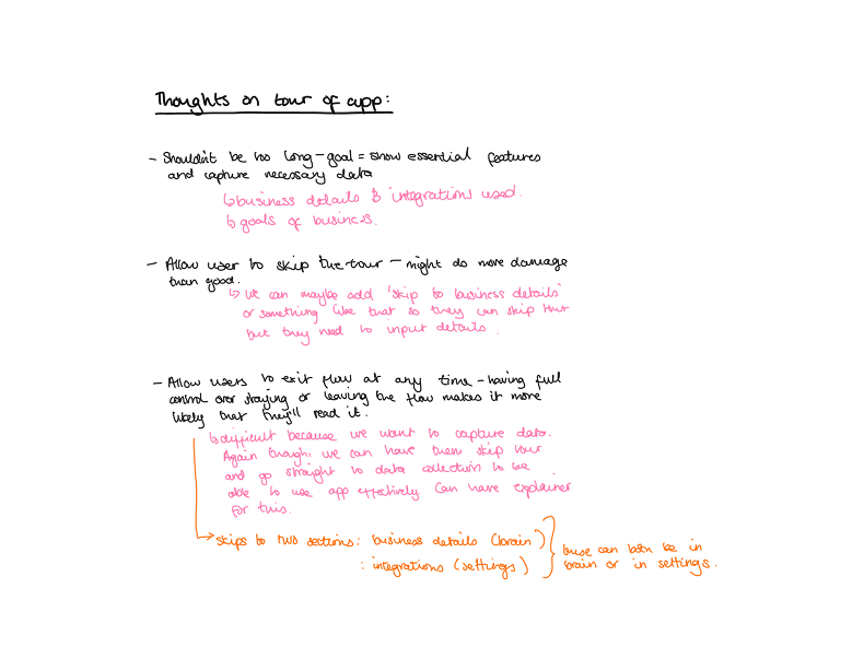
Thoughts
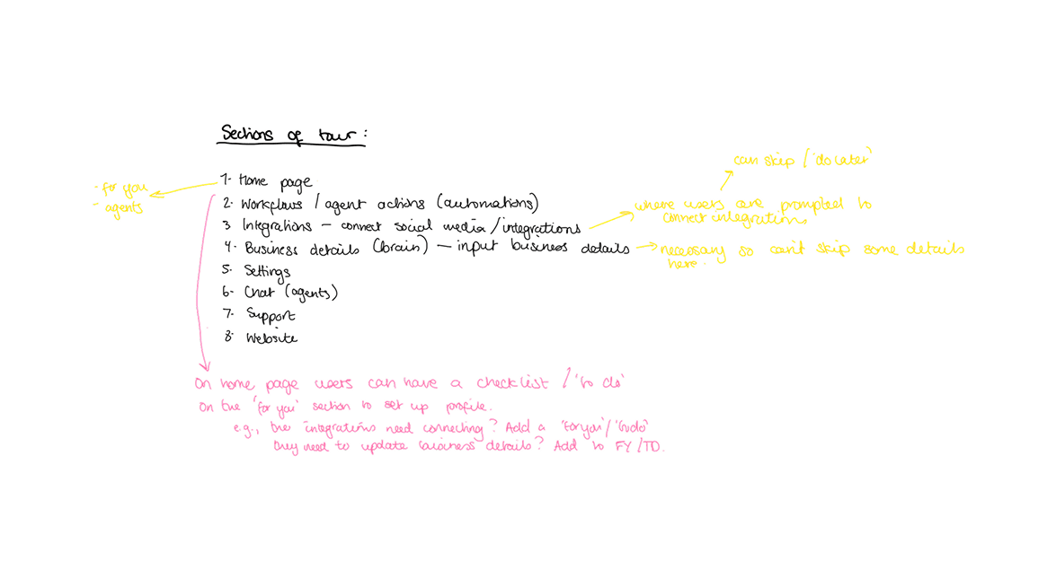
Mapping Out Sections of The Guided Tour
To design an effective onboarding experience, I first mapped out the key sections of the app and structured the tour to guide users through them in a logical order. The goal was to identify which parts of the tour were essential – both for capturing necessary user data and for helping users understand how to use the app's core automation features.
The essential sections included:
Integrations – to ensure users connected the tools they rely on
Business details (Brain) – so agents could access relevant company context and personalise their interactions
I also identified two areas as strongly recommended:
Chat (Agents) and Workflows/Agent Actions – so users could clearly see where automation happens and how to manage it effectively
All other areas of the app were considered optional within the tour, giving users the flexibility to explore at their own pace while still ensuring they received the necessary guidance to get started successfully.


Next Steps
Note: This concept is currently on hold due to shifting business priorities, but high-fidelity wireframes are planned and will be added soon.