PQS Calculator
PQS Calculator
PQS Calculator
YouGov PQS
YouGov PQS
YouGov PQS
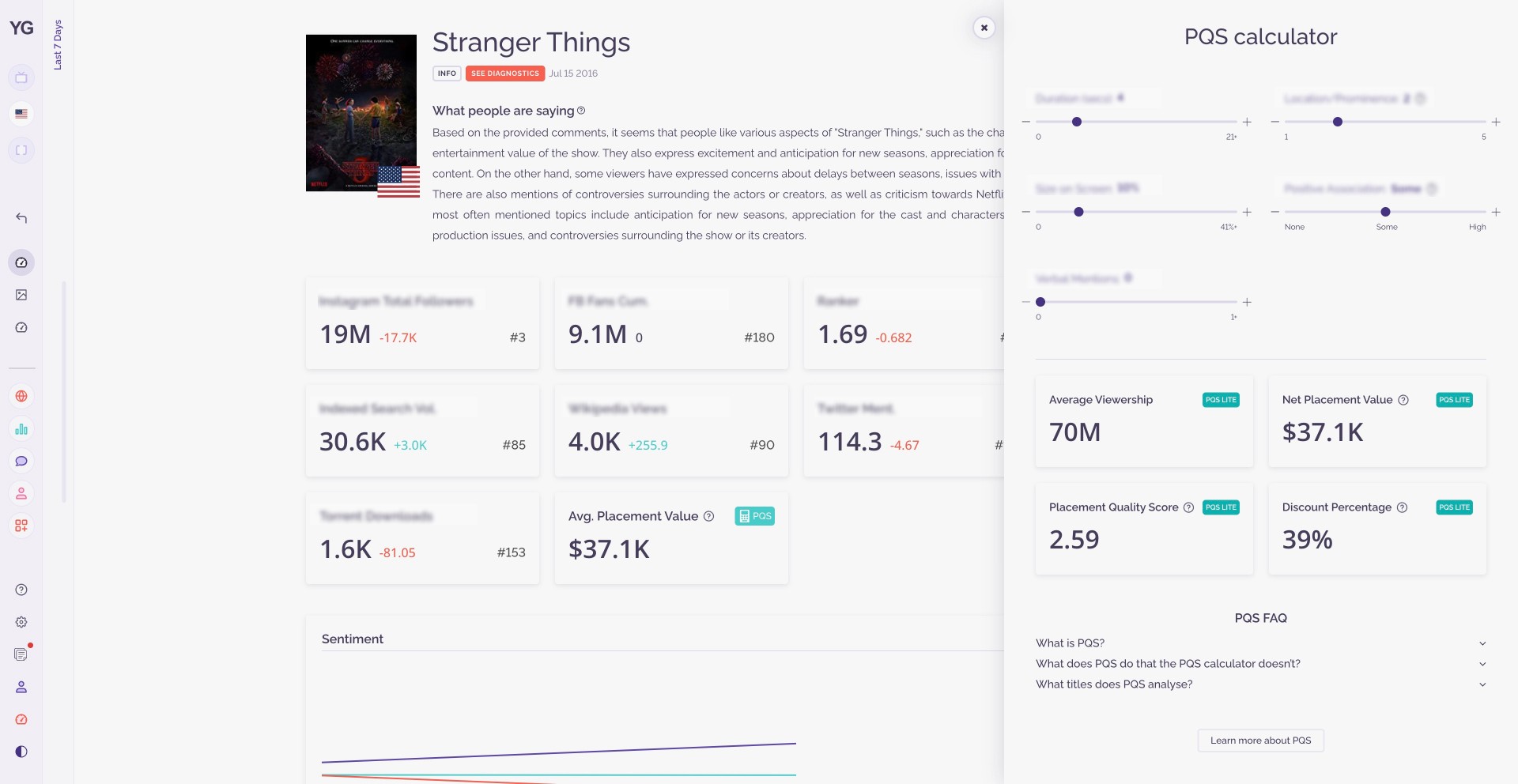
Following a product-led growth strategy for some of the products in their innovation unit, YouGov wanted to build a "Lite" version of a dashboard for valuing product placements in TV shows and Movies. The dashboard would allow users to simulate the value of a product placement in any TV show or movie, and included an FAQ to educate users and a call to action underneath to allow them to handraise.
Following a product-led growth strategy for some of the products in their innovation unit, YouGov wanted to build a "Lite" version of a dashboard for valuing product placements in TV shows and Movies. The dashboard would allow users to simulate the value of a product placement in any TV show or movie, and included an FAQ to educate users and a call to action underneath to allow them to handraise.
Following a product-led growth strategy for some of the products in their innovation unit, YouGov wanted to build a "Lite" version of a dashboard for valuing product placements in TV shows and Movies. The dashboard would allow users to simulate the value of a product placement in any TV show or movie, and included an FAQ to educate users and a call to action underneath to allow them to handraise.


the context
the context
The purpose of the feature was to drive new revenue opportunities for YouGov PQS, YouGov's product placement valuation solution. Working with YouGov PQS's product lead and front end developer, I designed a solution with a sense of responsiveness and fun that allowed users to easily see the values of different product placements, while still being in keeping with the visual language of the larger product it sat within.
To date the feature has led to several handraisers for PQS and has indirectly generated 6-figures of revenue for YouGov.
the challenges
the challenges
the challenges
We needed to figure out the easiest way for users to simulate the calculation while making it interactive and fun to use.
Initially, I designed the calculator with a drop down menu, however, we wanted to make it more interactive and fun to encourage users to test out the calculator.
We needed to figure out the easiest way for users to simulate the calculation while making it interactive and fun to use.
Initially, I designed the calculator with a drop down menu, however, we wanted to make it more interactive and fun to encourage users to test out the calculator.
We needed to figure out the easiest way for users to simulate the calculation while making it interactive and fun to use.
Initially, I designed the calculator with a drop down menu, however, we wanted to make it more interactive and fun to encourage users to test out the calculator.
the iteration process
the iteration process
the iteration process
Version 1
Version 1
Version 1



First iteration…
As seen from the iteration above, I initially integrated the calculator directly onto the overview page alongside the other metrics. However, it became apparent that this approach occupied an excessive amount of space on the page and clashed with the overall aesthetics. Consequently, we made the deliberate decision to refine our design.
So we tried a pop-out modal…
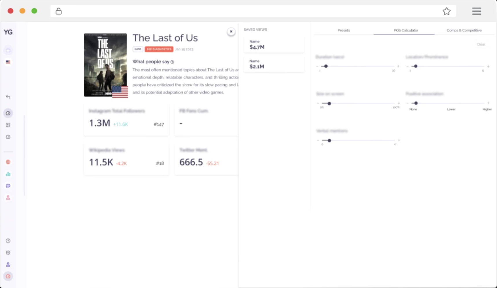
We introduced a metric on the page similar to other metrics on the page to maintain visual continuity. This metric is clickable and upon clicking, a pop-out modal would appear from the side as seen below. We kept the sliders and also incorporated a side-bar for "saved views," allowing users to store their previous calculations.
Version 2
Version 2
Version 2


Getting closer…
We liked the slider's appearance and where it sat on the page, however we found there was too much white space and not enough information in the pop-out i.e., there was no box showing the final calculation results. We needed to create a box prominently showcasing the Placement Quality Score. We also wanted to add some extra context to help folks understand how the calculator arrived at its final answer via other metrics such as the Average Viewership and Net Placement Value etc.
Why choose a slider over a drop-down?
The slider takes up less real-estate on the page, which was important to ensure visual continuity. Sliders also give users an instant visual cue about the value's scale and current status with just a quick glance. It's just more intuitive compared to a dropdown menu.
final iteration
final iteration
final iteration


dar.
dar.
dar.